


Video: Inside ATFP Gala 2013

Photo Gallery: ATFP Gala 2013


The Economist
July 25, 2012 - 12:00am
http://www.economist.com/blogs/graphicdetail/2012/07/daily-chart-16?fsrc=scn/ln_...
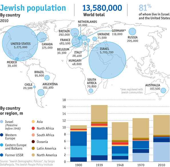
Mapping the world's Jewish population and migration patterns
JUDAISM is enjoying an unexpected revival, according to a special report to be published in this week’s Economist. The map and chart below show where the biggest Jewish populations live and how this has changed over the past century. In 1939, Jews numbered 16.5m people, up from 10.6m in 1900. By the end of the second world war, the Nazis had wiped out one-third of them, sweeping away a thousand years of Jewish civilisation in central and eastern Europe. The death toll might have been even higher, but a flurry of pogroms that started 60 years earlier across the then-tsarist empire had sent waves of Jewish emigrants westward. By the time Hitler struck, some 6m Jews were safe in North and South America and in Britain, with 3m more living in the Soviet Union. From 1948, most of the Jews of north Africa and the Levant emigrated. The break-up of the Soviet Union brought the latest big wave of Jewish migration to Israel in the early 1990s.
»
TAGS:
Recent Daily News Articles
| What is to be done between now and 2SS? | September 17, 2017 |
| The settlers will rise in power in Israel's new government | March 14, 2013 |
| Israeli Apartheid | March 14, 2013 |
| Israel forces launch arrest raids across West Bank | March 14, 2013 |
| This Court Case Was My Only Hope | March 14, 2013 |
| Netanyahu Prepares to Accept New Coalition | March 14, 2013 |
| Obama may scrap visit to Ramallah | March 14, 2013 |
| Obama’s Middle East trip: Lessons from Bill Clinton | March 14, 2013 |
| Settlers steal IDF tent erected to prevent Palestinian encampment | March 14, 2013 |
| Intifada far off | March 14, 2013 |
Recent News

.@ZiadAsali: By focusing on transition phase, good governance must top agenda to build Palestinian infrastructure
https://t.co/fL2mlkG4Y5
7 years 26 weeks ago
|
In @TheNatlInterest ATFP Pres. @ZiadAsali asks if the two-state solution still exists?
https://t.co/fL2mlkG4Y5
7 years 26 weeks ago
|
RT @Ibishblog: This is sober and correct https://t.co/217oW6j5eC
7 years 26 weeks ago
|
American Task Force on Palestine - 1634 Eye St. NW, Suite 725, Washington DC 20006 - Telephone: 202-262-0017